Over the past two years we have learnt so much from this journey ! We have had so much fun blogging and we are sad that it is coming to an end! We have spent hours trying so hard to try produce a blog and content which shows our technical ability and skills which we have learnt throughout. There has been many very stressful moments and bloppers which have occured. We are really proud of what we have produced and hope some of our products can inspire others! As a group we have worked really hard together and have bonded over this significantly.
What have you learned from your audience feedback?
Throughout the whole process, we continuously asked for audience feedback on all our music video, Digipak and Magazine Advert. This was because the main purpose of the music industry is entertainment and it is for the audience. This post is about how we used our audience feedback and what we learnt from them.
MUSIC VIDEO
Rough Cut In this blog post, I listed the things we changed after receiving feedback from it. Receiving audience feedback about our rough cut was really helpful for us because it showed what things we had to change or edit as our video is mainly for the audience and hearing what they thought of it meant we could tweak our video to their wants.
First Cut
We then made a first cut after making changes from the audience feedback we made from our rough cut and asked for feedback on that too. In this blog post, I listed things we changed to make our first cut:
Final Cut
These feedbacks resulted in making changes for our final cut:
AUDIENCE FEEDBACK - GENRE
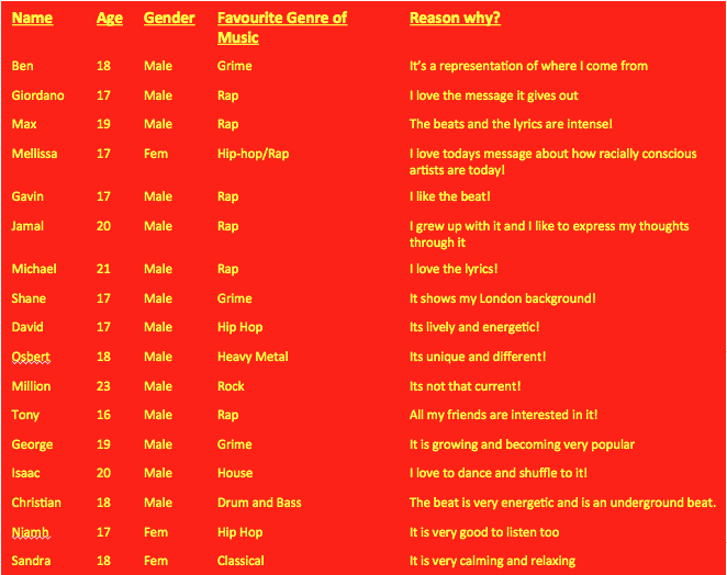
We asked many people of different ages (focusing more on our target audience... (Rap/Hip hop with subtle hints of grime). I found out their age, genre, favourite genre of music and why. This helped us to work out my demographic and gender whom we will attract our video and ancillary texts towards. we found that even our original intention was to capture the male audience however from this research we found an female audience was also growing within our target audience. Overall as tsome of the members of the research was a different age, many prefered rap/hip hop and they were some others such as drum and bass and hip hop. I also found other conventions from other music genres, E.g. 'It is very calming and relaxing.' Therefore we aimed to achieve this in our music video.
To choose our magazine design we had to ask for audience feedback on what they thought was the better still image. Living in a technological generation, we used social media to communicate with the young target audience in order to receive quick and genuine feedback. We asked them to choose between photo number 1, 2, 3 or 4:
I sent out an online poll because it was easy to make and easy for the audience to answer as it was just a simple click to choose. After using the online poll, I gathered all data and put them in a bar graph as it was easier for us to see the gap of what people preferred against what they least liked. Here were the results:
Below is some feedback of reasons why some of our target audience choose each photos. It was from the social networking of Twitter.
So, from this, we used photo 3 for our magazine advert and worked on that. Also, because people liked it so much, we used it for our digipak front cover too. We made our first product and asked for feedback on them too.
Hearing this feedback, receiving both good comments and critics, we made further tweaks which led us to creating a better final magazine advert:
Making a magazine advert cover then helped us in creating a digipak. We started off with using the same still image, as our front cover, and then using similar stills of the artist for synergistic purposes. We received feedback for our first digipak product, which essentially were all positives.
Reasonable locations. For a rap video it can follow any location as long as it can connect with what the lyrics of the character is meaning. Sometimes also if a narrative is played alongside the lip-sync location is better to be isolated so that the lyrics can mean more.
In addition to this a rap video will include mainstream/casual costume design, this is so that the audience do not become so focused on what the artist is wearing and they can connect with the visuals/lyrics.
'A$AP ROCKY' and 'Kendrick Lamar are two influential rapper's who follow this stereotype and are some of the rappers I used as a key source of ideas and imagery.
'Dear Lana': LOCATIONS
Locations were used to highlight the meaning of the lyrics, and to highlight the narrative for our audience to understand and relate to it.
Artist lyric location
These are just isolated rooms. This is so that the audience are not distracted by anything during the video and can connect and feel the emotion of the lyrics.
Suburban Alleyway
This was on of the subtle hints the grime genre had on our music video. It is a typical convention within that genre. Due to availability we had to use this rather public area for the fight scene.
Domestic Location- Bedroom
This is help create the narrative of the ending where our artist wakes up to show 'a day in a life' of the character.
Subverting the Rap/Hip Hop genre
A convention of the rap/hop genre which I did not include was the extravagant, luxury lifestyle stereotype of the genre. I didn't include this because I felt it was totally the wrong message I was trying to get for my audience to understand and I felt using this was not only give the wrong impression but contradict the message by the artist.
These are some examples of rap artists that use the extravagant, luxury lifestyle stereotype. This tends to sexualise women, show of designer clothes, and show money as only an object
Gucci Mane - Nonchalant
Rick Ross "Same Hoes"
Meek Mill - On The Regular
In addition to this we tried to not to focus on some anti-social behaviour usually expressed in a rap video. For example the overuse and focus on Drugs / Guns etc.
Some examples of this are
O.T. Genasis - CoCo
Slim Jesus - Drill Time
Snoop Dogg & Wiz Khalifa - Young, Wild and Free ft. Bruno Mars
However some audience members may recognise our imagery of the drug culture within the rap industry. This can be seen through the drug deal.
Music video conventions
Technical conventions
A final aspect technically which we tried to show was the use of the 'Fourth Wall'. This is when there is an 'invisible wall' between separated between the actor (Tawanda) and our artist. This is too create a direct relationship/contact between both our artist and the audience.
This works very well due to the lyrics within our track touching on topics of racism, the education system, drugs. By having this technical aspect the audience can feel the message more clearly and find it a lot more meaningful on the audience.
Here are when the fourth wall is broken in our music video.
Here is Drakes example of using the 'fourth wall' during his music video of 'Hotline Bling'.
After researching real media print products in the grime genre, I created this digipak/poster in order to conform to the grime conventions and create a realistic finish.
From the feedback we received on our rough copy, we have made some altercations and this is our final magazine advert.
BEFORE AND AFTER
The Changes we made:
Lighter colouring of the red, from audience research we were told that the red was too strong and perhaps represented something related to love such as a love letter due to the title 'Dear Lana'
The fade at the top was quiet patchy and overall didn't have a flow, we therefore changed the colouring to white so that titles and ratings could be seen with also the social networking sites shown.
More emphasise design on our character, we used a filter to make our artist Tawanda (Kaner Flex) to stand out more and show a more artist/unique design.
Here is the range of Magazine photo cover options we had taken while we were filming.
1)
2)
3)
4)
As a group we came to a decision that we will be choosing the last photo to use as our main Magazine cover photo. (picture 4)
We used this image because it was a straight up shot of our artist in our music video and we found it was more useful compared to our other shots. It also incorporates the white lighting which we similarly used in our magazine advert.
This is one of the first inside covers, as you can see text within the picture represents all of the emotions and problems the artist the is trying to convey. as you can see the words are powerful, such as 'Public enemy', 'The warning', 'The problem' and more.
These are all words targeting social problems which is what the album is mostly about.
As you can most of the picture is grey highlighting that all the social problems aren't as simple as black and white and have a deeper rooted cause e.g. kids failing in education can not just be blamed on the child solely as that is too simple but can be blame on institutional racism and the family.
The artist himself is covering his eyes suggesting that he is ashamed of what he sees
The red emphasise his love and passion for the cause.
In this picture the artist is at a train station suggesting that the artist is going to take us on a journey with this album an that he will be showing us a display of emotions as his emotion can vary due to the different possible emotions that could be on his face due to him facing away.
However one could argue he is looking for an escape from this corrupt society hence why he is looking waiting for a train and checking for when it arrives.
Finally the location is in a train station, which is London Underground. This highlights the routes of the track.
As we decided to use our 'artist' as our main selling point, he is the central point of the composition.
The font colour of our font is red. This colour can relate to anger. This is because the message our artist 'Kaner Flex' is trying get across relating to racism, the education system and social justice system is a huge dividing issue in the world we live in today. Kaner has a opinion which he wants to get across. We therefore thought the colour of red can highlight this.
Also the colour of red represents love and lust which represents the love he has for his music and the love of the person he is writing this album too.
We therefore think red can incorporate the two contrasting emotions he is trying to convey in the album.
The 'parent advisory explicit content' logo is included as they're is some explicit language during the track. These lyrics are 'you're calling me crazy, making assumptions but the system is fucked'. This is why we used this logo so our audience recognizes there may be some strong language within the track.
This is the lyric booklet and the picture on the front is another picture of the artist in this picture he is hiding his face. This is often typical with black youths and he is emphasising why people portray them a certain way, however one could arguing he is say just because you dress a certain way dose not mean you conform to the stereotypes set out by society e.g. he is dress this way but he is not in a gang or violent. the lyrics are going to be inside the booklet. the contrast of the picture again highlights the contrast in his lyrics.
Graffiti is a element which has come hand in hand with the rap culture as when it began in the 1970s - We are incorporating this in our Digipak as it can reflect some meanings of which our artist 'Kaner Flex' speaks about in the music video.
Many famous artists such as 'Banksy' reflect on social/ethical problems in everyday life, our artist 'Kaner Flex' does this similarly, however through his lyrics. We therefore wanted to try convey a similar type of art on our CD cover.
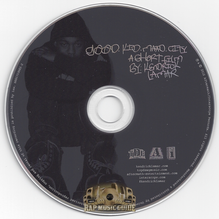
Most real forms of music discs, with genres such as pop and indie, have plainly coloured discs. For example, Ariana Grande's, who is a pop artist, disc is plain black with her name engraved along the top with the name of the album. It is plain black to fit the mood of her album and because she is an established artist, she does not have to do much self-advertising. We decided to adhere to the convention of the artist's name and album name being incorporated as it is an general element of a music CD design. However, because our genre is rap/hip-hop, we thought including themes that relate to our music genre, like graffiti and black and white, will add extra effect to informing the audience our music video genre. Real rap artists' discs that include more designs, as opposed to just black like Ariana Grande's, include Kendrick Lamar's and 50 Cent.
Our final Digipak back cover shows an opposite side to our front. It is the back to our artist as well as the back to our digipak. This connotes this is a reflection of the artist as a whole and combines both our digipak and artist together. We thought that this was a interesting concept to include on our digipak.
Our 'artist' is the synergistic element of all our media products, so it was a necessity to include him in both front and back covers of our digipak. Making the artist the Unique Selling Point (USP) allows us to create its own target audience. For example, if an artist was around 50-60 years old, they would not necessarily be making rap songs, as rap is a genre dominated by young teenagers and adults, but instead perhaps classical or folk music genre and have a target audience of around their ages. Because our artist looks/is young, our audience would likely be made up of young people.