Showing posts with label Tawanda Nambureti (6117). Show all posts

Thursday, 27 April 2017

Farewell Post.


GOODBYE!


Over the past two years we have learnt so much from this journey ! We have had so much fun blogging and we are sad that it is coming to an end! We have spent hours trying so hard to try produce a blog and content which shows our technical ability and skills which we have learnt throughout. There has been many very stressful moments and bloppers which have occured.  We are really proud of what we have produced and hope some of our products can inspire others! As a group we have worked really hard together and have bonded over this significantly. 


 Group 2 - Aidan, Vianca and Tawanda.


Thursday, 15 December 2016

Evaluation activity 4 - Tawanda

Throughout the production process, we used a variety of different types of technologies.

The hardware we used included:
- Canon DSL 650 D
- IMac
- Mic
- Flipcam
- Lights (and with Filter)
The software’s we used were:
- Final Cut Pro
- Blogger

Hardware
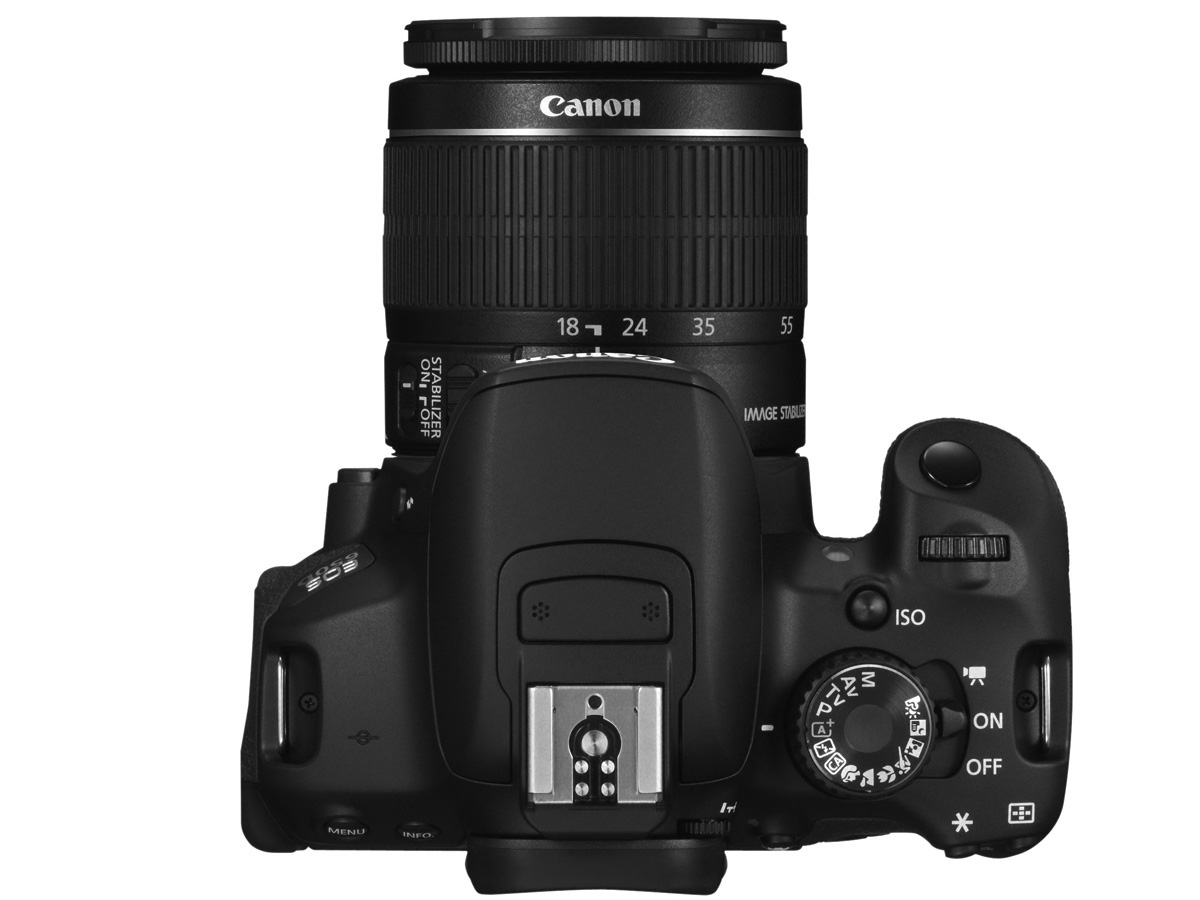
DSLR Canon D650 with an 18-55m zoom lens
Pros
The zoom lens allows to change focal points between the range of 18-55mm, this means we don’t have to move to get closer the subject as you would with a Prime lens. To add the focal length of the lens, allow the flexibility to do close ups at 50mm, mid shot at 35mm and wide shots at 18mm and the focus ring allows the image to be sharp. The lens had options to of autofocus, which detects the distance the subject is from the lens and changes the focal length automatically rather than using the focusing and zooming ring. Also, the lens has image stabilisation controls to make video smoother while recording.
The camera is 18 megapixels this mean the video can be expanded to a certain extent (3872 x 2592) without becoming pixelated, as there are 18 million pixels in the camera. This is not evident on a small screen when comparing to a 10-megapixel camera however on a much larger screen the 18-megapixel camera is crisper compared to the 10 megapixels.
The camera was also touch screen making the user interface was very easy to use. The fact that the camera had touch screen there was shortcuts to many things such as ISO change, aperture, shutter speed and white balance. The camera only has a couple buttons to change over two dozen settings, so the touch screen shortened that process.
Cons
Battery life was an issue for us since we had to use 2 battries. The battery is an 1100mAh battery, this is slower than most smartphones that are currently out. The battery can only last 2hrs 10m while continually recording. This was an issue for us because we were contently switching our camera on and off to preserve battery life. As a result of the poor battery life, we had restricted the number of taking per shoot only one take, meaning we had very limited footage to pick from.
The Camera performed poorly in low light areas this was evident when we saw the grain in the raw footage. This was because the ISO was too high as a result creating the grain, however, we had to do this as it would have been too dark to see the subject. The lighting we had was not bright enough to get rid of the grain. Also, the larger the viewing screen is the more the grain.
Lastly, the camera had an inbuilt mic that was very poor the mic picked unwanted sounds such as the zooming and focusing ring was operating this as a result meant that we were unable to use it for dialogue. However, we were luckily supplied with an external Rode boom mic.

IMac with IOS X
Pros
Image result for mac
The macs had enough memory to hold all of our footage and other groups as well, software data and documents we used for our researching and planning. The mac would also autosave work if anything were to go wrong e.g. the computer freezing or crashing.
The IMac monitors had ultra HD retina display this meant during post production we were able to view and tweak our footage with precision and accuracy due to the immense detail that was displayed these monitors. To add the monitors also had front HD cameras, which I used to record many of video blogs. During the pre-production stage.
The speaker on the macs where amazing especially for internal speakers, we were able to listen to audio which was incredibly crisp and balanced. This was extremely useful in the post production stage as we could use them to distinguish if the artificial sound such as the breathing sounded realistic. They honestly exceeded my expectations. The mic on the IMacs was also amazing because they picked up audio really well, for example, the audio was so sensitive that people had to be dead silent while recording.
Cons
The only con for the IMacs is that occasionally they kept crashing, freezing or lagging. This was most likely down to the computers having very little RAM or a slow processor this meant that it was very difficult to multi-task with the computers not crashing.

Rode mic
Pros
The mic had an adapter, this adapter allowed it mount on top of the camera this made it much easier to make what is usually a two-man job very simple as it is attached to the camera. This also benefited us in the fact that we could pick up audio directly from where we are pointing the camera
The mic also had a noise cancellation feature this meant that unwanted ambient sound could be blocked from entering the actual mic it's self-meaning you can concentrate on the sound you want to isolate such as the music we where rcording to guide us while editng the footage which is the reason why the lip sink was so precise and on beat whith the real song.
Cons
The cons of this would be the fact that, although there was noise cancellation, the mic would still pick up quite a lot of ambient sound. It was so bad at one point we had completely get rid of all the audio that was in the last shot because of the loud background noise.


Software
Final cut pro
Pros
Used to edit any footage that was to be put onto YouTube for our blog - e.g. interviews, focus groups interviews and our music video. That best thing about this was that it saved everything u have ever edited meaning if you lose it or are told to re-edit then it’s extremely quick and simple. You’re also able to keep the editing and videos of interviews, focus groups interviews and our thriller very consistent.
Simple concept, in terms of cutting and editing a single footage. This is also because the final cut pro software’s user interface was fairly simple to use as it had so many shortcuts that you could use with less than three simple presses e.g. command + Z undo’s a mistake u just did or command +B which splits the footage.
Worked well on Macs meaning the older version was just as good as the newer one even using the old one on the old computer was still hustle free.
Cons
Sometimes froze when added too many footages this would often slow down the overall editing process, however, we are lucky as the iMacs would auto automatically save the progress we had done, as a result it was a simple fix.
Quite difficult to cut to the exact spot you want to cut to solve this issue I zoomed closer into a single footage and cut to the spot I needed to. This is also something slowed down our progress.
Another problem we face was the fact that the macs cut our fotage meaning we where unable to edit so as a result w where struggling to recover the fottage

Blogger
Pros
Used in pre-production and post-production, we mainly use blogger to record everything we have been doing leading towards the production process, then after we finished we did evaluation such as this. This is because blogger is so easy to blog on because of the simple user interface.
Able to alter time and date to have an organised group navigation bar. This means easy for people to actually view your blog, if it’s extremely large, due to the organisation.
Able to upload things from a variety of websites, such as YouTube, Prezi and Sound cloud. This is due to the embedding codes meaning you codes upload a presentation from Prezi, YouTube or sound cloud by just simply copying and pasting the codes.
Cons

The images sometimes don't lay where I want them to be - however, I attempt to place it elsewhere where it would look just as presentable. However, they could easily fix this by allowing more places to put rather than left right and middle.

Evaluation activity 3 - Tawanda

What have you learned from your audience feedback?

Throughout the whole process, we continuously asked for audience feedback on all our music video, Digipak and Magazine Advert. This was because the main purpose of the music industry is entertainment and it is for the audience. This post is about how we used our audience feedback and what we learnt from them.

MUSIC VIDEO 


Rough Cut

In this blog post, I listed the things we changed after receiving feedback from it. Receiving audience feedback about our rough cut was really helpful for us because it showed what things we had to change or edit as our video is mainly for the audience and hearing what they thought of it meant we could tweak our video to their wants.


First Cut

We then made a first cut after making changes from the audience feedback we made from our rough cut and asked for feedback on that too. In this blog post, I listed things we changed to make our first cut:


Final Cut

These feedbacks resulted in making changes for our final cut:


                                            AUDIENCE FEEDBACK - GENRE 


We asked many people of different ages (focusing more on our target audience... (Rap/Hip hop with subtle hints of grime. I found out their age, genre, favourite genre of music and why. This helped us to work out my demographic and gender whom we will attract our video and ancillary texts towards. we found that even our original intention was to capture the male audience however from this research we found an female audience was also growing within our target audience. Overall as tsome of the members of the research was a different age, many prefered rap/hip hop and they were some others such as drum and bass and hip hop. I also found other conventions from other music genres, E.g. 'It is very calming and relaxing.' Therefore we aimed to achieve this in our music video.


PRINT PRODUCTS


Print Products - Eval 3 from Shane

To choose our magazine design we had to ask for audience feedback on what they thought was the better still image. Living in a technological generation, we used social media to communicate with the young target audience in order to receive quick and genuine feedback. We asked them to choose between photo number 1, 2, 3 or 4:


I sent out an online poll because it was easy to make and easy for the audience to answer as it was just a simple click to choose. After using the online poll, I gathered all data and put them in a bar graph as it was easier for us to see the gap of what people preferred against what they least liked. Here were the results:


Below is some feedback of reasons why some of our target audience choose each photos. It was from the social networking of Twitter.


So, from this, we used photo 3 for our magazine advert and worked on that. Also, because people liked it so much, we used it for our digipak front cover too. We made our first product and asked for feedback on them too.


Hearing this feedback, receiving both good comments and critics, we made further tweaks which led us to creating a better final magazine advert:


Making a magazine advert cover then helped us in creating a digipak. We started off with using the same still image, as our front cover, and then using similar stills of the artist for synergistic purposes. We received feedback for our first digipak product, which essentially were all positives. 


Evaluation activity 2 - Tawanda

Evaluation activity 1 - Tawanda

CONVENTIONS OF A MUSIC VIDEO:


CONVENTIONS OF THE RAP GENRE:

MISE-EN-SCENE (Visual Motifs)
Dark locations, Black outfits usually consisting of track suits, props that link with the lyrics or stereotype of the genre for example Drugs or gold rings and lastly Dark lighting that is high in contrast lighting.

Dear Lana by Kaner Flex
LOCATION
The locations that were chosen to create my music video are very contrasting. Therefore, I was able to work with a collection of scenes that had different assortment of colours as well as a derelict estate which is typical of the rap genre. I found that this variety of different locations helped create the Dark and thought provoking ambiance that is seen in the Rap genre.

WHITTON HIGH STREET  
Perfect scenery to get that  gritty vibe we are so used to rap videos as fitness


DARK THEATER ROOM
Surrounded darkness and by a purple backdrop to connote wisdom and strength within his mind this dark type room is quite typical in most rap/Grime songs.


HOUSE
A typical estate house with the typical surroundings of an avid rap listener, used to set the scene with multiple dark colours again typical in grime music especially the high contrast with ba fade type look .


PROPS
This was my initial plan for what props I would have wanted to include in my grime music video... However, due to having a very low production budget, I was only able to get a few. Nevertheless, I still found that the props used in the overall final cut of the video were successful in creating the atmosphere of the grime genre.

PROP INITIAL IDEAS:

these were: fake GUN                                  Fake Drugs             Smart Phone


`


PROPS USED:
In the end I used the smart phone and the fake due to the fact that our budget was rather low, however for the gun we simply used one of the actor hand which was still extremely effective as it gave it more intimacy even though the audience was just looking at hand that was implying he was shooting. These made it more personal because the gun almost detaches someone from a killing. These are all typical convention in terms of props within the rap genre.


SUBVERTING THE RAP/GRIME GENRE CONVENTIONS
1) A convention seen in many Rap genre video There are many low-angled, close up shots in hip hop videos, to imply the artist's’ power over their audience. The low angle gives them the power, because they look down on the audience and the close up gives status because it implies they’re important enough to have a frame to themselves.
These are examples of pop artists that included these shots in their music videos...
Kendrick Lamar - Alright
Joey badass - no.99

Drake - energy
Image result for drake energy
Another convention of the rap genre genre (in terms of mise-en-scene), is the use of quite jeallary.
An example for this is the use of gold chains on many artists in today's hiphop culture…

2 Chainz - Birthdaysong

ANCILLARY TEXTS

Digipak:

Magazine Advert:


From researching real media print products in the rap genre, I created this digipak/poster in order to conform to the hip hop conventions and create a realistic finish.

  • The rap genre has a typically a very dark and raw and contrast heavy ambiance, therefore, it was crucial for my advert to include clear, bold fonts and contrast to colour as well as my digipak hence why the heavy use of the black and white colour scheme as well as red to also add synergy to the music video.
FONT AND DESIGN
Keeping the fonts and colours of the text the same for the entire digipak was important to make my digipak look professional whilst still conforming to the genre of our music. Again, I researched real hiphop/grime album back covers to guide me with the design and the end result was quite a professional look.

IMAGE CHOICE
The images used are images of the artist in and is in the centre of the composition adding symmetry to make it look professional as well as make him the centre of attention. Most real media products generally have the artist right dead centre as well. Wee added the painting effect to make him seem as an iconic genius that has word that have been remembered throughout history which is what our artist is all about the lyrical aspect of the rap genre


Thursday, 1 December 2016

Final Products

Final print products

We have three final print products, 1) Our music video    2) Digipak     3) Magazine Advert.


1) Music Video


2) Digipak


3) Magazine Advert


Final Magazine Advert with Analysis

Final Magazine Advert

From the feedback we received on our rough copy, we have made some altercations and this is our final magazine advert.


BEFORE AND AFTER

The Changes we made: 

  • Lighter colouring of the red, from audience research we were told that the red was too strong and perhaps represented something related to love such as a love letter due to the title 'Dear Lana'
  • The fade at the top was quiet patchy and overall didn't have a flow, we therefore changed the colouring to white so that titles and ratings could be seen with also the social networking sites shown.
  • More emphasise design on our character, we used a filter to make our artist Tawanda (Kaner Flex) to stand out more and show a more artist/unique design.

Feedback to Rough copy of Magazine Advert


This is our rough-cut of our magazine advert.


This some feedback we recieved from a member of class.


We are going to use this feedback to try and construct our final magazine advert.

Designing our Magazine idea

Designing our Magazine Idea

Here is the range of Magazine photo cover options we had taken while we were filming. 

1)

2)

3)

4)

As a group we came to a decision that we will be choosing the last photo to use as our main Magazine cover photo. (picture 4) 

We used this image because it was a straight up shot of our artist in our music video and we found it was more useful compared to our other shots. It also incorporates the white lighting which we similarly used in our magazine advert.


We then came up with a magazine idea.
Here it is:


Digipak Audience feedback


Final DigiPak - Inside Covers


INSIDE COVERS


  •  This is one of the first inside covers, as you can see text within the picture represents all of the emotions and problems the artist the is trying to convey. as you can see the words are powerful, such as 'Public enemy', 'The warning', 'The problem' and more.
  • These are all words targeting social problems which is what the album is mostly about.
  • As you can most of the picture is grey highlighting that all the social problems aren't as simple as black and white and have a deeper rooted cause e.g. kids failing in education can not just be blamed on the child solely as that is too simple but can be blame on institutional racism and the family.
  • The artist himself is covering his eyes suggesting that he is ashamed of what he sees
  • The  red emphasise his love and passion for the cause.


  • In this picture the artist is at a train station suggesting that the artist is going to take us on a journey with this album an that he will be showing us a display of emotions as his emotion can vary due to the different possible emotions that could be on his face due to him facing away.
  • However one could argue he is looking for an escape from this corrupt society hence why he is looking waiting for a train and checking for when it arrives.
  • Finally the location is in a train station, which is London Underground. This highlights the routes of the track.

Final DigiPak - Front Cover

Front cover


  • As we decided to use our 'artist' as our main selling point, he is the central point of the composition.
  • The font colour of our font is red. This colour can relate to anger. This is because the message our artist 'Kaner Flex' is trying get across relating to racism, the education system and social justice system is a huge dividing issue in the world we live in today. Kaner has a opinion which he wants to get across. We therefore thought the colour of red can highlight this.
  • Also the colour of red represents love and lust which represents the love he has for his music and the love of the person he is writing this album too.
  • We therefore think red can incorporate the two contrasting emotions he is trying to convey in the album.
  • The 'parent advisory explicit content' logo is included as they're is some explicit language during the track.  These lyrics are 'you're calling me crazy, making assumptions but the system is fucked'. This is why we used this logo so our audience recognizes there may be some strong language within the track.